 Have you ever gone to a website only to become very frustrated because you can’t find what you are looking for? Or the functionality falls short of the mark?
Chances are yes you have. And usually you will exit that website pretty sharply to find an alternative source for the information or product you want. This is clearly not what you want your potential customers doing when they come to your website.
Typical User Journey Issues
Badly Structured Navigation – Your navigation needs to be simple, concise and very intuitive. It needs to be structured in an ‘expected’ way, with products or sections that are easy to find. Don’t hide things away with too many levels of navigation. Rule of thumb is that every part of your website should be accessible within two clicks from the home page.
Poorly Designed Checkout – Are their too many steps to check out? Are there broken parts in the checkout so the visitor can’t complete their transaction? Remember that many people buy online through a mobile phone – is your site responsive and therefore easy to use from a phone?
Broken links – There is nothing worse than clicking on a link on a page only to be taken to a 404 error page. It diminishes confidence in the website and the company. Use a site crawl tool like screaming frog to show you where the problems are and fix them.
Weak internal linking – Are you making the most of internal linking? For example on a page, do you provide links to related pages or products to encourage further sales or give the viewer more information thus holding their attention for longer? Upselling and cross selling can not only increase revenue but creates a good visitor journey which increases confidence in the company.
Lack of Calls to Action – It is very important to make it as easy and obvious as possible for people to complete their journey on your website in the way you want them to. If you want them to call you – put the phone number top, middle and bottom of every page. If you want them to fill a form, download something or check out a Cart – make them visible and easy to locate!
Functionality Issues – These can be anything from clunky, slow loading pages to tools that don’t work and forms that don’t send. Be sure to check your website in all the different browsers i.e. Chrome, firefox and Internet Explorer. Some site designs don’t display or function the same way on different browsers.
So how can I monitor weak areas of my website?
All too often, website owners are so familiar with their own site; they know where everything is and probably don’t even look at it very often. They forget to think like a new visitor. Keeping a close watch on the data in your analytics is the key to being aware of areas on the site which may be problematic for potential customers.
Analytics
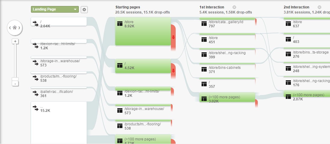
Looking at exit pages to see where visitors have left your website, will give you a little insight to where people might be dropping out of the sales funnel. But if you look at the ‘behaviour flow’ section you will see the full path of their journey on your website.
See below a typical view of the busiest pages on a website. Hovering over the pages gives you more stats about the percentages of drop offs. If none of this makes sense to you don’t worry, analytics training is ideal if you want to learn these skills for yourself.
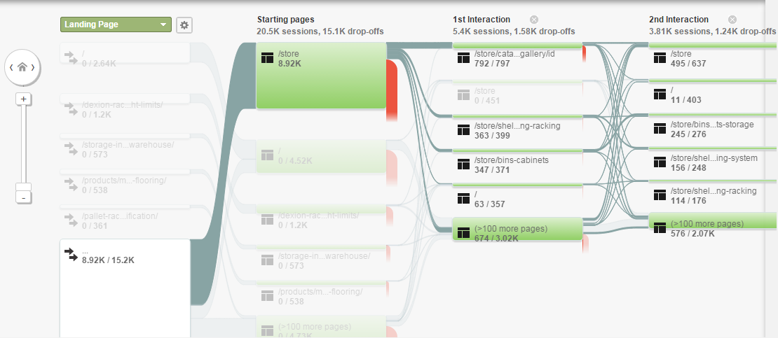
You can drill down to individual pages in the same way to really analyse problem areas on a website:
Tracking Enquiries
Be mindful though that if you are a serviced based business that a ‘bounce’ or an ‘exit’ may not necessarily mean a failure to convert. The person may have picked up the phone at that point to call you. With this in mind, it is very important to track enquiries internally to make sure you know how and where people are finding you. Larger companies with higher volumes of enquiries may want to use a trackable phone number to monitor enquiry stats.
Conversion Rate Optimisation (CRO)
Analytics is great for showing you stats and figures on your website, but what it can’t do is give you human feedback or opinion. So, it can tell you that 60% of traffic through a page on your site exits BUT it can’t tell you why!
Coversion Rate Optimisation is the practice of improving your website performance to increase leads or sales. By analysing data, visitor journey, user testing and feedback it is possible to make the most of your website traffic and increase your conversions. Your conversions are whatever you wanted your visitor to do e.g. buy a product, sign up to newsletter, fill in a form, ring for a quote etc.
CRO is a huge topic and worthy of its own blog post but one of the elements that feeds into it is the user journey and user testing.
User Testing
Having unbiased people test your website’s usability, functionality and styling is a very valuable insight into the visitor journey and will highlight very quickly any barriers to conversion. Read more information on user testing here. This kind of testing can sometimes show that just moving a button on a checkout page, or changing its colour can make all the difference to conversion.
Usually there are bigger issues though, but actually seeing users testing the website and watching them struggle to find something or miss something completely is immensely valuable and can help you make decisions to turn your online strategy around.
Need help?
If you don’t feel you are making the most of your website’s potential to convert visitors and want some help to understand where it is going wrong or help you improve the visitor journey and user experience then call one of the team on 01285 50 55 50.


